STEP 7
Check For The
Mobile / Tablet Responsiveness
Things to Do:
- Test your site on various devices and screen sizes
- Make necessary adjustments to improve mobile user experience
- Watch out for: Non-responsive design elements that may break on mobile devices
- Use the Chrome Development Tools for multiple devices
- Optimize your images for mobile.
Check Your Site on Mobile Devices
It would be nearly impossible to check your website on every device, however, there are some tools available to help ensure that your site will look great across all devices.
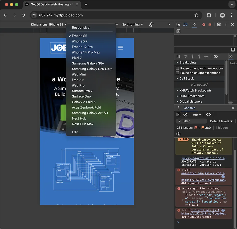
Chrome Development Tools
Use the Chrome developer tools in the Chrome the browser to see your site on various devices. Their tool allows me to quickly check the site on smart phones, tablets and small laptops to see how it will look and function.
The Divi theme does a great job in being responsive but there are always small tweaks you will need to make to ensure that it is responsive on all devices. Checking the site on real devices is great if you can. Use the smallest phone and tablet, If it look good there then its more than likely going to be fine on larger devices. Check against the iPad Air setting in the chrome dev tools, this setting seems highlight anything that would go wrong when viewing on any tablet.
Mobile First
Mobile-first web design prioritizes creating websites for smartphones and tablets before adapting them for desktop screens. This approach acknowledges the growing prevalence of mobile internet usage and ensures optimal user experience on smaller devices. Designers start by focusing on essential content and features, progressively enhancing the site for larger screens. This method typically results in faster-loading, more efficient websites that are inherently responsive and user-friendly across all devices.

Mobile Friendly Optimization
Every time someone visits your website on their mobile device they are using part of their data plan to upload your site. It's important to resize and optimize your images for mobile or direct them not to show at all on mobile when possible. Google appreciates mobile sites that load quickly and so does your end user . Remember, not everyone has the same high speed, unlimited data plan you may enjoy, so keeping your site optimized will enable fast loading times, contribute to keeping visitors on your site longer, reduce bounce rates, and increase conversions.
Have Questions?
Please contact me directly.
Free Consulting is just a phone call away.
904-501-9526
Ask for JOE
STEP 8
Implement Security Measures